Details:
Client: City of Powder Springs
Location: Powder Springs, Georgia
Status: Complete
Highlights:
Description:
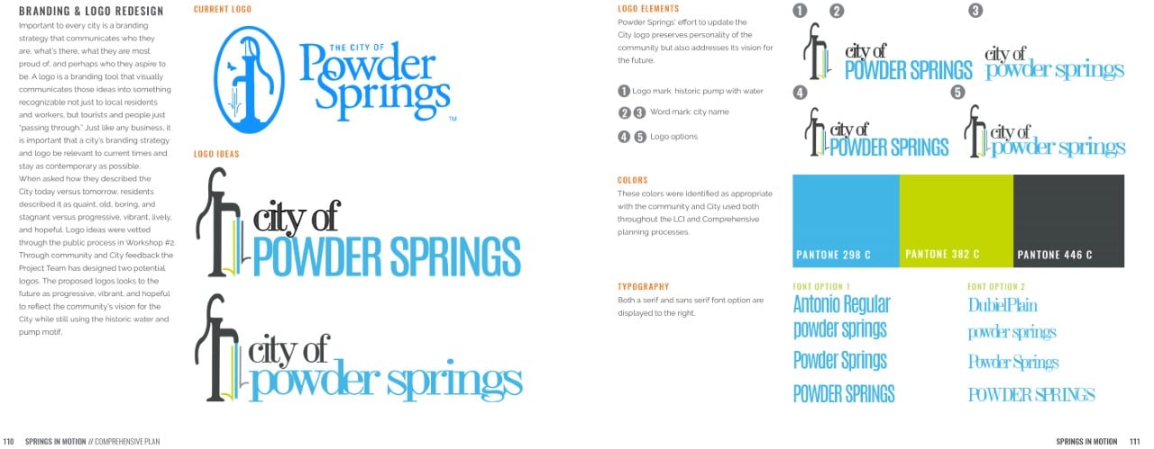
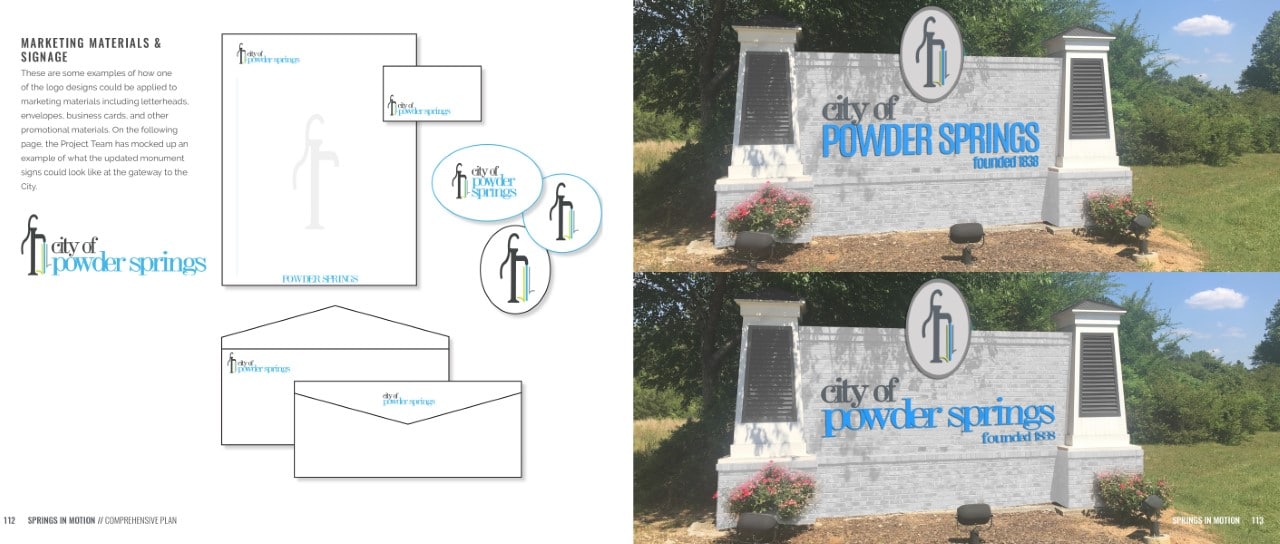
TSW was retained by the City of Powder Springs in 2016 to lead a team to prepare a major update to the City’s Comprehensive Plan, the updated plan is titled Powder Springs Place Based Branding. A key component of this effort was to help the City rebrand itself, as a strong branding strategy is important for every city as it communicates who they are, what they have to offer, what they are most proud of, and who they aspire to be. A logo is a branding tool that visually communicates these ideas in a way that is easily recognizable to residents, workers, tourists, and people just passing through. Just like any business, a city’s branding strategy and logo must be relevant to current times and stay as contemporary as possible.
During the branding process, the TSW team asked residents to describe the City of Powder Springs today and how they envision it in the future. Residents described the City as quaint, old, boring, and stagnant, and expressed a desire for it to be seen as progressive, vibrant, lively, and hopeful. To gather feedback on the new branding, the team held a public workshop where they presented different logo ideas to the community. Through feedback from the community and the City, the project team designed two potential logos that reflect the community’s vision for the City as progressive, vibrant, and hopeful, while also incorporating the historic water and pump motif.
The proposed logos were designed to be modern, contemporary, and reflective of the City’s vision for the future, while also paying homage to its history. The final logo was chosen by the City and community, and it will be used to represent the City in all of its marketing and communications. The logo will be an important tool in helping the City rebrand itself and communicate its new identity to the public.

